Website is a big project and while designing one can seem like a daunting task, this doesn’t have to be the case. Whether you are a designer or a developer, or even just someone planning to get an online presence as a property agent in Singapore, with little experience, the web design process can be made much easier with a bit of smart planning.
These are some of the important things that you should consider when you design your website to make the process easier, we hope you find this a useful guide…
1. WHO IS IT FOR?
It’s crucially important to start by knowing who you are designing your website for. You need to ask yourself ‘who is my target audience?’ and take some time to understand the demographic that you have in mind. Imagine that the website you are about to create is for a clothing brand selling to young people. In this instance, you are likely to be looking to pop culture for inspiration.
2. HOW BIG IS YOUR WEBSITE?
Once you have determined who your website is for, the next step is to plan the structure. Think of this as the blueprint. At this stage, you will be creating the site map and you need to start at the top with the homepage. From there you need to create a map of all the other pages on the site. Every page will need feedback on the homepage but ask yourself where else they need to go. Contact pages, about us, pages, further content, blogs? You need to consider the scale of your website and what information you will display.
3. CONTENT
This leads us to the content of your website. This may not be top of your list when you consider the overall design, but it certainly should not be underestimated. In 2016, when users were given 15 minutes to consume content, 59% said they would prefer it to be beautifully designed so the combination of the two is important. Think of the website like a blank sheet of paper. Just having a few words on this piece of paper will be very boring and not great to look at. You need your content to help to keep people on your site. A lack of a clear message is the biggest turn-off for consumers, with 46% claiming this to be the reason for leaving a site. Good content can engage your audience, help you from an SEO perspective and convey your key messages to your customers. It is vital to use your content in a way that is ‘beautifully designed’ so that it is effective in delivering this.
4. IMAGERY
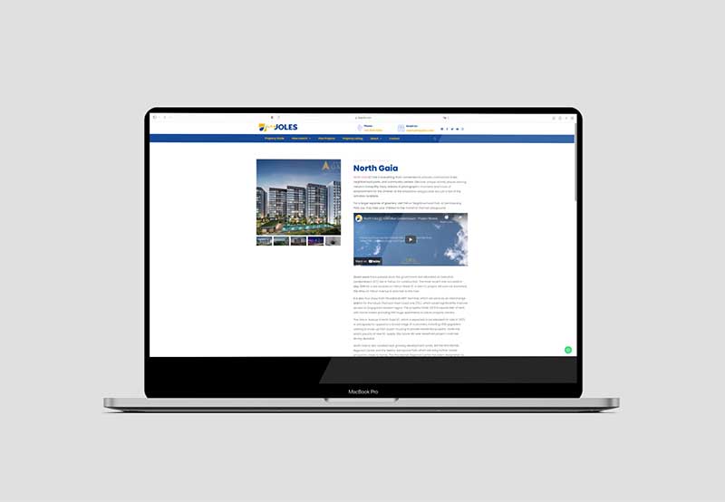
Once you have your content, you need to think about images. In particular, you need to consider where they are going to come from. You have a few different options that you could use. You could take the images yourself, and this is the quickest and cheapest way of getting imagery for your website. However, you may not be the best photographer, and do you want your site to suffer just because you wanted to scrimp on the images? Alternatively, you could hire a photographer to get all the images you want. This is an expensive solution but, if you have a high-quality brand image that needs to be maintained, this might be the only way that you can get the right quality of image for your needs. The final option is to use stock images. You can get some images to flesh out your website for a reasonable price and there is a very wide library of images available online for this. However, these images can be generic and might not represent your brand powerfully enough. One of their client’s important projects, North Gaia, we managed to create galleries of great resolution images with minimal loading time.
5. USABILITY
Usability is vital to the success of your web design. One of the main considerations is consistency. You need to break down all the elements that you are going to use, such as buttons, hover states, and menus. If you include clickable elements in rounded rectangles, then all your buttons should be rounded rectangles. In 2016, rounded shapes reigned supreme in web design and 87% of all Photoshop shapes had rounded corners (84% of all shapes designed in sketch). Avoid using this visual cue for any other element. It is all about using subtle indicators that train the user to use your site instinctively. Think carefully about menus too. Hamburger menus have become the norm for lots of different websites but, from a usability point of view, they still aren’t as intuitive as simple header navigation (unless on mobile where they are more common). The simpler you can make the journey, the better the user experience you create.
6. RESPONSIVE
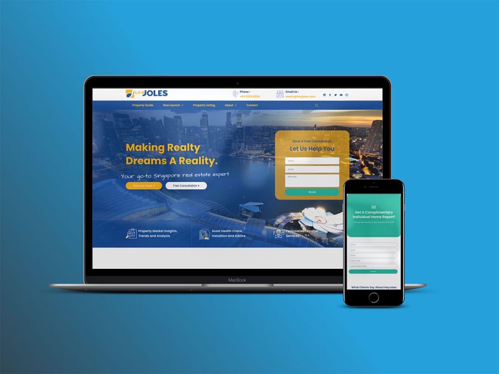
We consume the internet in so many ways these days, with people choosing to access the web from many different devices. From smartphones to widescreen televisions, there are so many screen sizes for a website to appear on. According to one study, consumers use an average of five different devices each and that gives you some perspective as to how important it is that your website is suitable for each of these different devices. Having a responsive site ensures that the user experience is so much better and this will help to keep people on your website. Indeed, it’s said that 62% of companies who designed a website specifically for mobile increased their sales. With this in mind, you are going to have to consider how your design will lend itself to a condensed space like on a smartphone.
