1. Understand Color Psychology
Color psychology is the study of how colors influence human behavior and emotions. Different colors evoke different feelings, so it’s crucial to align your color scheme with your brand’s message and the emotions you want to elicit in your audience. For example:
- Red: Often associated with energy, urgency, and passion. It’s commonly used for calls to action or to create a sense of urgency.
- Blue: Conveys trust, calmness, and professionalism. Many corporate and tech websites use blue to establish reliability.
- Green: Linked to growth, nature, and health. It’s a popular choice for environmental or health-related websites.
- Yellow: Represents optimism, energy, and happiness, but it can be overwhelming if overused. Use it sparingly for highlights or accents.
- Black and white: Used for sophistication, luxury, and simplicity. Monochromatic schemes are often found in high-end and minimalist designs.
By understanding the psychological impact of colors, you can align your color choices with the goals and values of your website.
2. Align with Your Brand Identity
Your website’s color scheme should reflect your brand’s identity. If your business already has established branding (like a logo or marketing materials), your website should use the same primary and secondary colors for consistency. Consistent use of colors across all platforms creates a cohesive experience for users, reinforcing brand recognition and trust.
For example, a company with a strong, playful brand may use bold, bright colors, while a professional consulting firm might opt for muted, sophisticated tones. Choose colors that complement your logo and other brand assets, ensuring that the website feels like an extension of your overall brand.
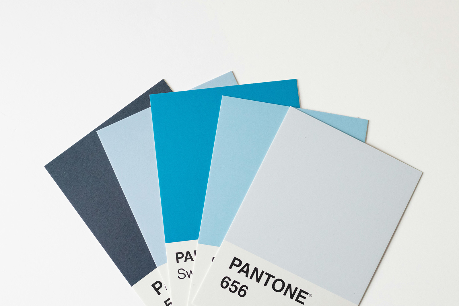
3. Choose a Primary Color and Complementary Palette
To create a balanced and visually appealing website, start by selecting a primary color. This is the main color that will dominate your design and be associated with your brand. Once you’ve chosen a primary color, build a complementary palette of two to four secondary colors that enhance the primary color without overpowering it.
You can use tools like Adobe Color, Coolors, or Canva’s color palette generator to find harmonious color combinations. Some common schemes to consider are:
- Analogous: Colors next to each other on the color wheel. These create a harmonious and visually pleasing look.
- Complementary: Colors opposite each other on the color wheel. This scheme provides high contrast and makes certain elements stand out.
- Monochromatic: Variations of the same color in different shades, tints, or tones. This creates a minimalist, elegant look.

4. Ensure Contrast and Readability
While it’s important to have a visually cohesive color scheme, readability should be a top priority. High contrast between text and background is essential to make sure users can easily read the content. For example, using dark text on a light background or vice versa ensures that the text stands out.
Tools like WebAIM’s Contrast Checker can help you ensure that your color combinations meet accessibility standards. Not only does this improve usability, but it also ensures that your website is accessible to people with visual impairments or color blindness.
5. Consider Your Target Audience
Think about your target audience when choosing a color scheme. Different demographics may respond differently to certain colors. For instance, younger audiences might prefer bright, bold colors, while an older demographic may gravitate toward more subdued, neutral tones. Consider the cultural connotations of colors as well, especially if your website targets a global audience.

6. Test and Iterate
Once you’ve selected a color scheme, test it across various devices and screen sizes. What looks good on a desktop may not translate as well on mobile or tablet screens. Gather feedback from users to see how they respond to the colors, and don’t hesitate to make adjustments as needed.
Conclusion
Choosing the right color scheme for your website is an essential part of creating an engaging user experience and communicating your brand’s identity. By understanding color psychology, aligning your palette with your brand, ensuring readability, and considering your audience, you can craft a color scheme that enhances your website’s appeal and effectiveness.